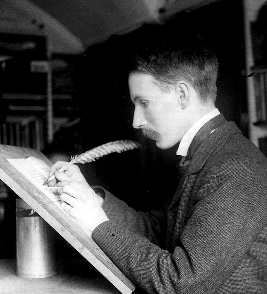
Edward Johnston was a modest man whose work is seen daily by millions of Londoners, yet few are truly aware of his contribution to society. Ruth Lawrence visited his home village of Ditchling, going ‘underground’ to discover more
Each day, millions of people, commuters, tourists, students and politicians among them pass the work of a gentle, unassuming man who lived in Ditchling during the first half of the twentieth century. His name was Edward Johnston and he designed the iconic typeface that graced London Underground and became one of the most memorable symbols of the capital.
Johnston was teaching Illuminating and Writing at the Central School of Arts and Crafts in London when he published his classic book, Writing and Illuminating, and Lettering, which still remains in print today. During the First World War, he was commissioned by Frank Pick, the man in charge of London Underground’s publicity, to design a typeface and roundel that would have “the bold simplicity of the authentic lettering of the finest periods.”
He had to supply a typeface that would differentiate bus and train destinations from the overbearing advertisements that were confusing travellers. Frank Pick chose Johnston on personal recommendation from Edward’s friend, Gerard Meynall who he knew as a trusted printer.
Johnston, by then the leading teacher and practitioner of lettering and calligraphy in the country, was an expert at analysing script. Initially he looked to the half uncial scripts of the Roman Empire but later, on advice, studied those from the Carolingian period, particularly the tenth century Ramsey Psalter which became the key to his later teaching.
For the London Underground typeface he turned to second century Roman capital letters typified by those at the base of the Trajan Column in Rome for his inspiration. These letters possess fine geometric proportions which are grouped into three distinct widths and have a timeless quality, which is the key to the success of the Johnston Underground Sans typeface. By 1916, the now famous Johnston Sans was the property of the Underground Railway and he eventually designed a compressed form to use on buses, replacing the near illegible alphabet in use.
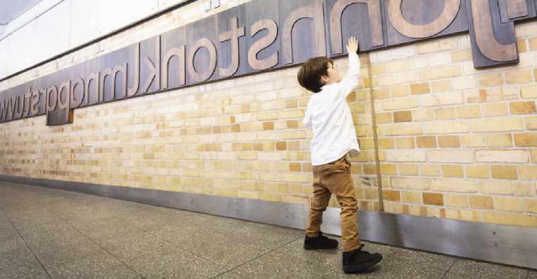
A hundred years later, Johnston’s typeface looks utterly contemporary after a century of providing instant visual recognition for London’s transport system. On June 24th 2019, he finally received a permanent memorial to his masterpiece which was unveiled at Farringdon station. The memorial is simple, bold and arresting, consisting of huge wooden printing blocks mounted on the station wall, detailing his entire lower case alphabet and containing his surname, discreetly slotted within the alphabet between letters ‘j’ and ‘k’
At sixty feet in length and displayed in reverse as in block printing, the construction of the alphabet was a major undertaking. Straight grained lengths of cherry wood had their edges machined into matching tongues and grooves before being cut to length and glued together to form a flat slab of the required width for each letter. Once each slab had been sanded, it was mounted in a computer-controlled routing machine where different cutter sizes were employed to form each letter’s shape by multiple passes of the tool.
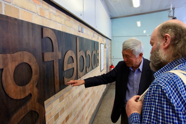
Once finished, the letters were inked to recreate the impression of printing blocks and coated with a fireproof finish before being mounted in order on rails attached to the station wall.
During the unveiling ceremony, Edward Johnston’s grandson, Andrew, made a speech, while accompanied by his own son and grandson, bringing three generations together for their ancestor’s memorial. Andrew commented that his grandfather was an unlikely choice to design the typeface, being neither typographer nor graphic designer but a self taught scribe, who had almost singlehandedly revived the lost art of formal penmanship.
Apparently, Johnston loved science and was always tinkering with tobacco tins, soldering them together to make various electrical gadgets. Andrew recalled a family postcard from Meynell to Johnston, humorously requesting ‘Dear sir, I am sending you two sardine tins, please make me a telescope and a motor bicycle’. Andrew mentioned how his grandfather’s alphabet was much easier to read than the previous incarnation, being better spaced and proportioned, and far more handsome. While conveying authority, it is a friendly typeface and has been called ‘London’s Handwriting.’
The centenary was marked by the introduction of the ‘Johnston 100’ which restored some original features of Edward’s design after it was modernised in the 1980s by Eiichi Kono, a graphic/type designer who also attended the unveiling of the memorial. Kono was commissioned to modify the original type to make it more suitable for modern needs and the ‘New Johnston’ ensured the type’s survival into the digital age.
Edward Johnston’s legacy is continued by the Edward Johnston Foundation, a registered arts charity based in Ditchling where he remained until his death in 1944. Dedicated to raising public awareness of calligraphy, the foundation aims to make Johnston’s valuable teachings accessible to everyone who is interested and to preserve the craft of calligraphy and the lettering arts.
They have recently published a superb comprehensive book on Johnston’s Underground typeface entitled simply ‘London’s Typeface’ which details the evolution of his design and its eventual celebration in the memorial at Farringdon. The book contains contributions from Andrew Johnston, Eiichi Kono and founder of the Edward Johnston Foundation, Gerald Fleuss, among others and is a fitting tribute to the humble man who revolutionised the visual efficiency of the London transport system.
For further information or to purchase London’s Typeface www.ejf.org.uk
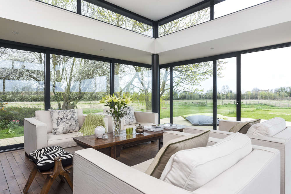 Home Style: Seeing the Light
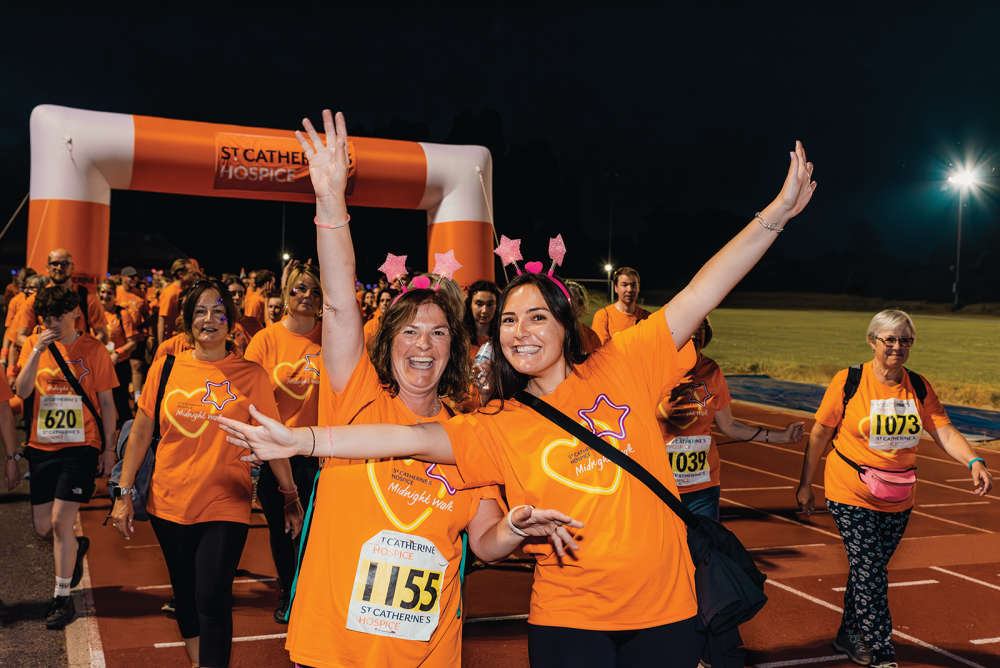 Step out for St Catherine’s Hospice
 If You Ask Me... This is Beyoncé Country
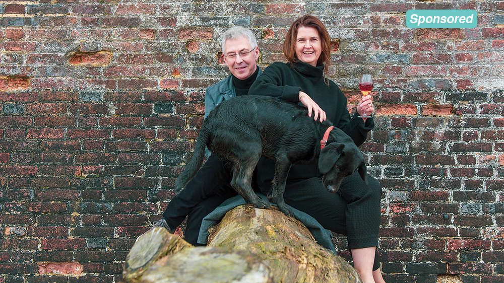 Artelium Wine – Crafted in Sussex
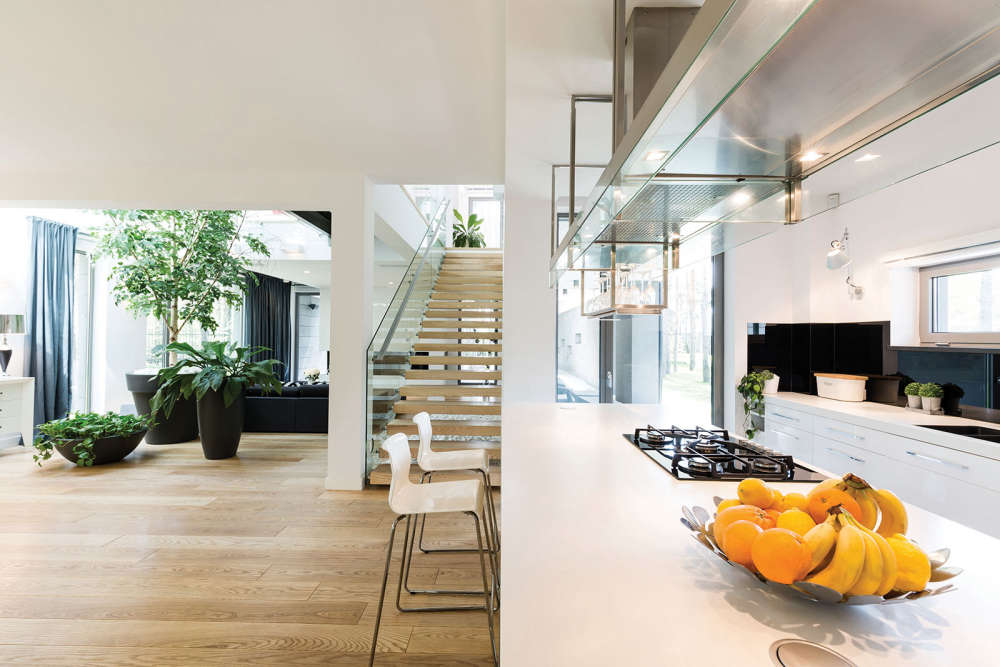 Homes Extra: Expanding Space
 Be Well, Move Happy: Gardening & Connecting with Nature
 Homes for Ukraine: Opening Your Home and Your Heart
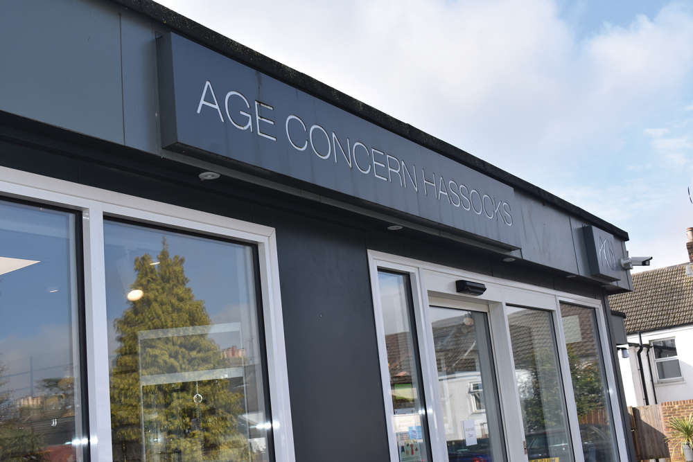 Charity: Age Concern Hassocks
 Another New Clinic For Sussex Audiology
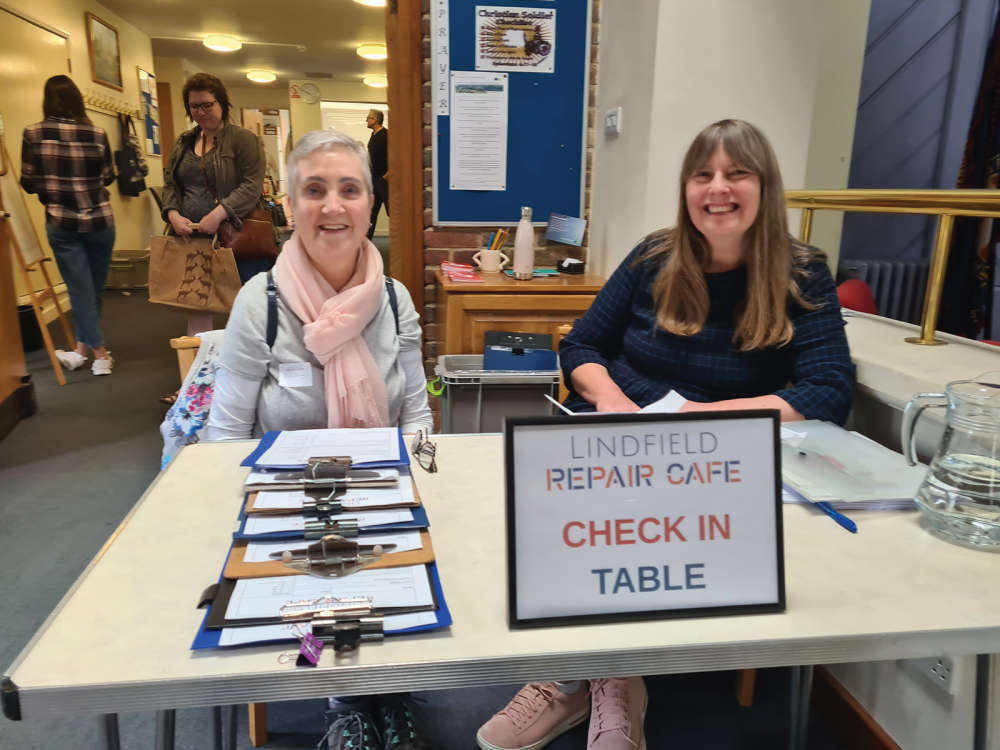 The Joy of the Repair Café
 Wills & Wakes
 Lighten the Technology Overload
 An Unlikely Retirement
 COMPETITION: Win A Two-Night Stay At The View Hotel With Afternoon Tea For Two
 What to Watch in April 2024
 Bucket List Travel Experiences
 Homes Extra: An Easter Home
 NEW COMPETITION: Win A Luxury Hamper For National Pet Day
 Home Style: Time to Heal
 Be Well, Move Happy: Meditation and Movement